Investor presentations will either sink or enhance your company’s value
In step 2 of the Premium Valuation Framework, we discussed how important it is for companies to leverage compelling communication tools to focus investor attention. Properly designed investor presentations enhance shareholder value by leaving investors with the perception that the company is more professional, relevant, competent, and mature than their competitors. Poorly designed investor presentations have the opposite effect… every time. Our design process helps management teams transform their investor presentations into an investment grade communication vehicle for the capital markets. We do this by mitigating and remediating the common errors that management teams make when producing investor presentations.
The Detail Trap
The detail trap is common amongst authors of investor presentations with a technical background. The technical details might be very important to these authors. But even if there is a detail of critical importance to the author, it may not be important to the capital markets. The details that are unimportant to the capital markets are at best a distraction, and at worst they can significantly detract from the message. It is often difficult for technical authors to step back and identify the difference.
Remember that less is more when it comes to the slides of your investor presentation. Another aspect of the detail trap is the temptation to cram too much relevant information onto one slide. It is far more effective for message retention and impact to pace the delivery of information. A good trick is to squint at a slide until it blurs, and identify the maximum of three to four messages you’re trying to deliver with a single slide.
Market climber has helped many companies remove unnecessary detail, pace information delivery, and enhance their presentation so that the facts that are most important to the capital markets are delivered effectively.
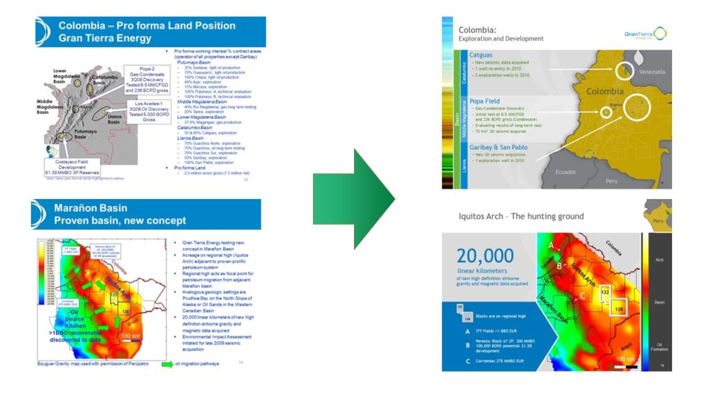
The Gran Tierra Case Study
In 2008 Gran Tierra was led by Dana Coffield. Dana was a talented geologist, a great leader and, behind the scenes, one of the world’s most accomplished mountaineers. Dana, being a geologist, naturally meant that Gran Tierra’s investor presentation was steeped in technical detail. Despite Gran Tierra’s great exploration and production performance, the market wasn’t giving them fair credit. We helped Gran Tierra focus their message, and elevate their presentation, which in turn helped enhance their valuation. The links to Gran Tierra’s investor presentation, both before and after our work, are below. Note the reduction in word count and the increased use of graphics throughout the presentation.
Gran Tierra Before – Gran Tierra After
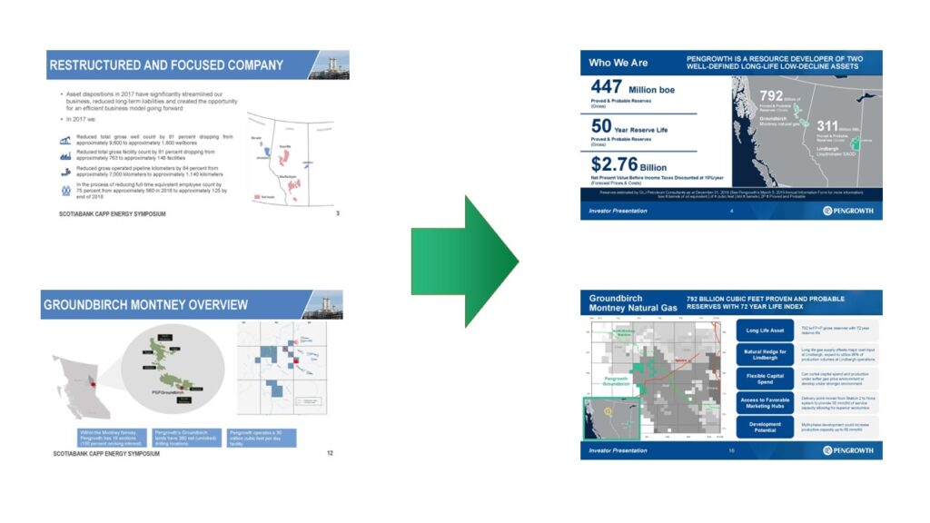
The Blandness Trap
Companies that do not have access to graphic design talent often wind up creating bland presentations. Whether it’s the result of a washed out color pallette, bland typography, or poor graphics, these investor presentations will fail to attract investment. Market climber has helped many companies elevate their investor presentations with a stronger color pallette, bolder typography, and better graphics. The links to Pengrowth’s investor presentation, both before and after our work, are below:
Pengrowth Before – Pengrowth After
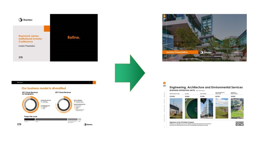
The Abstract Trap
The trap above typically impacts companies without graphic design resources. The abstract trap most often impacts companies with large communications and graphic design departments. Whether it is an obsession over their brand look and feel, too much time to tinker, or a lack of understanding about how the capital markets communicate, abstract investor presentations almost always miss the mark. The links to Stantec’s investor presentation, both before and after our work, are below:
Stantec Before – Stantec After
Use Hero Images to Inspire the Imagination and Ignite Understanding
If a picture is worth 1,000 words, then using heroic imagery should allow a company to reduce the word count of its presentation. In the Stantec case study above, it is worth noting the use of larger images to capture investor attention.
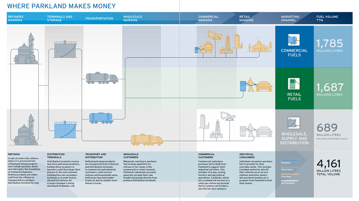
Demonstrate Where Your Company Fits in the Value Chain
Graphics that illustrate your place in an industry and how your company makes money are also a powerful way to clarify your company’s purpose to investors. We developed the figures below to effectively convey Parkland’s and Black Diamond’s position in their respective value chains at the time.

Use consistent informational frameworks
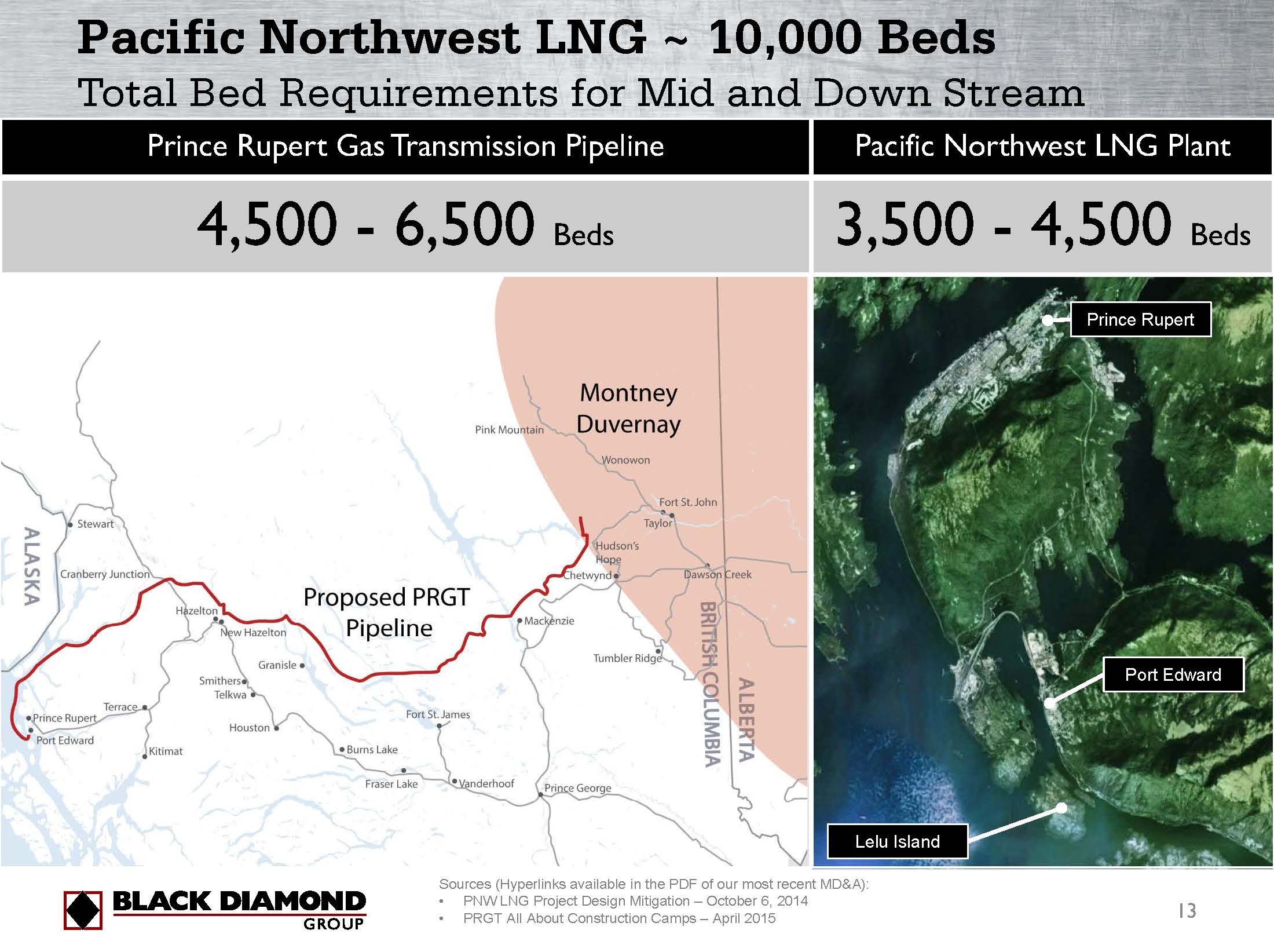
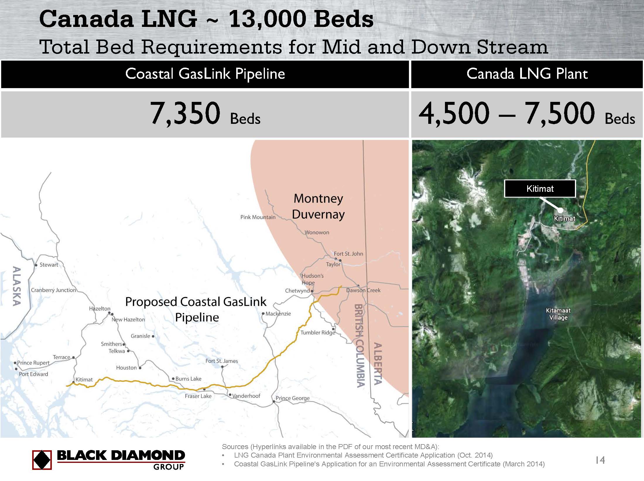
If you have multiple subjects with similar sets of information, be consistent in positioning the information. This is relevant for companies with multiple operating segments with a similar set of metrics, and for companies pursuing multiple opportunities with similar information. We developed the figures below for Black Diamond to describe two pipeline opportunities they were pursuing at the time.
Conclusion
Properly designed investor presentations can drive shareholder value by ensuring companies create the perception that they are “bigger”, more relevant, more competent, and more mature than they currently are. Poorly designed investor presentations hinder shareholder value by doing the opposite. These are only some of the tools we deliver for our clients. Our design process helps management teams transform their investor presentations into an investment grade communication vehicle for the capital markets.